About the Client
Qlerate is a deep-tech company focused on compute acceleration and quantum-ready infrastructure—helping advanced teams move complex workloads from experimentation to reliable, real-world performance. The brand needed to feel visionary, but also grounded in trust, clarity, and technical credibility.
Challenge
The main challenge was to create a visual identity that communicates infrastructure and reliability first, while still carrying a clear link to Quantum and the idea of controlled acceleration. The result had to work equally well in investor/enterprise contexts and in practical product environments—UI, icons, and technical materials—without falling into “speed clichés” or overly decorative tech aesthetics.
Branding
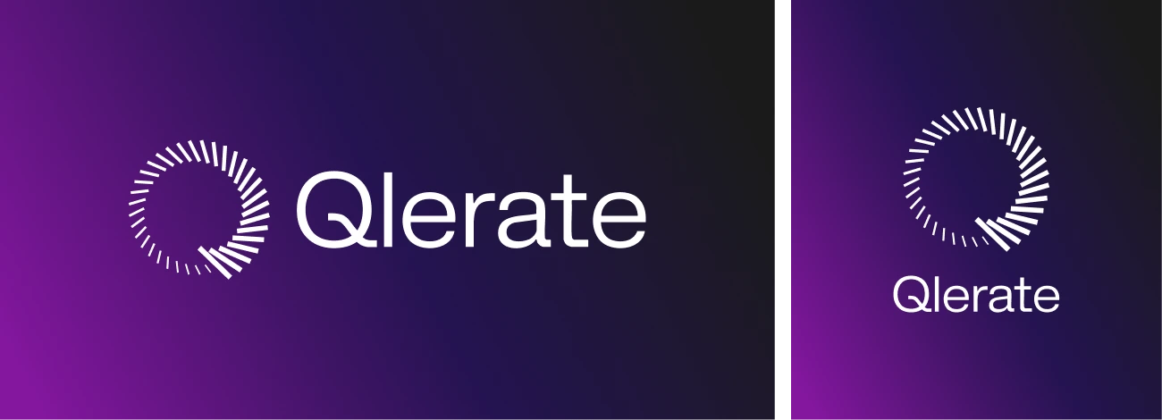
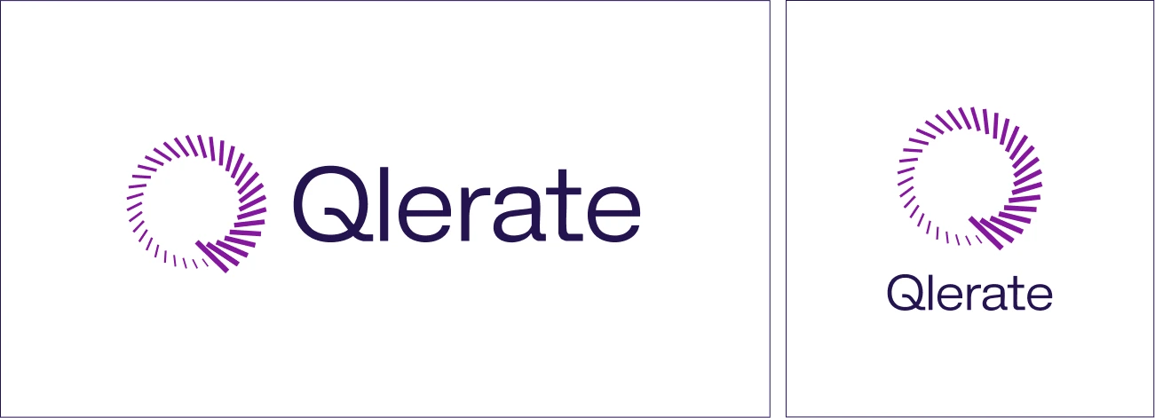
Logo Design
This logo expresses infrastructure, scalability, and controlled acceleration. The segmented ring signals systems and reliability, while the shift from sparse to dense segments suggests increasing throughput—moving from pilot to operational performance without clichés.
Its geometry is engineered, not decorative, so it stays clear at small sizes and works well in product UI, icons/favicons, and technical materials. The neutral sans-serif wordmark keeps the identity legible and enterprise-ready, letting the symbol carry the distinctiveness. Overall: precise, scalable, credible.
Color Palette
The palette is designed to support a deep-tech identity with clarity and trust at its core. It prioritizes high contrast, legibility, and a calm, enterprise-ready tone—so the brand stays confident across dark and light environments, from decks to product interfaces. Accent tones (when used) are reserved for “signal moments,” reinforcing the idea of controlled acceleration rather than visual noise.
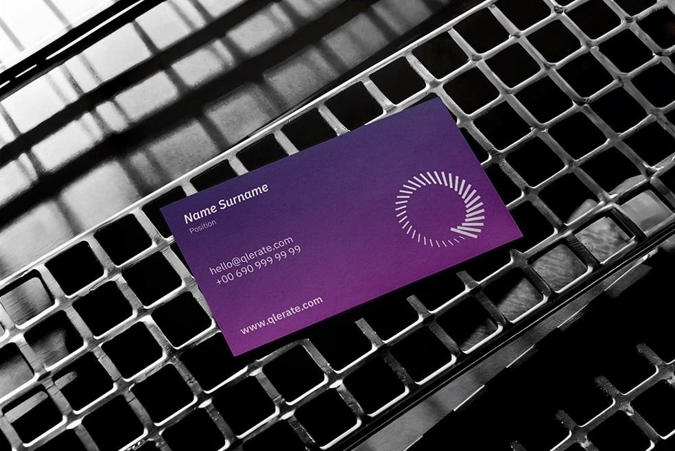
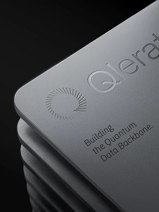
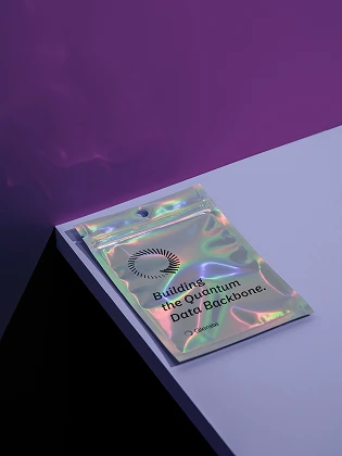
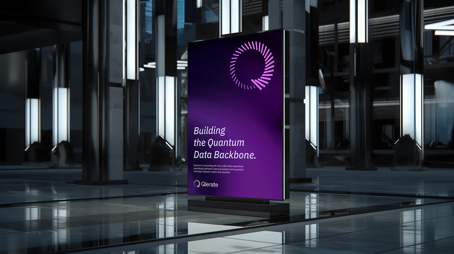
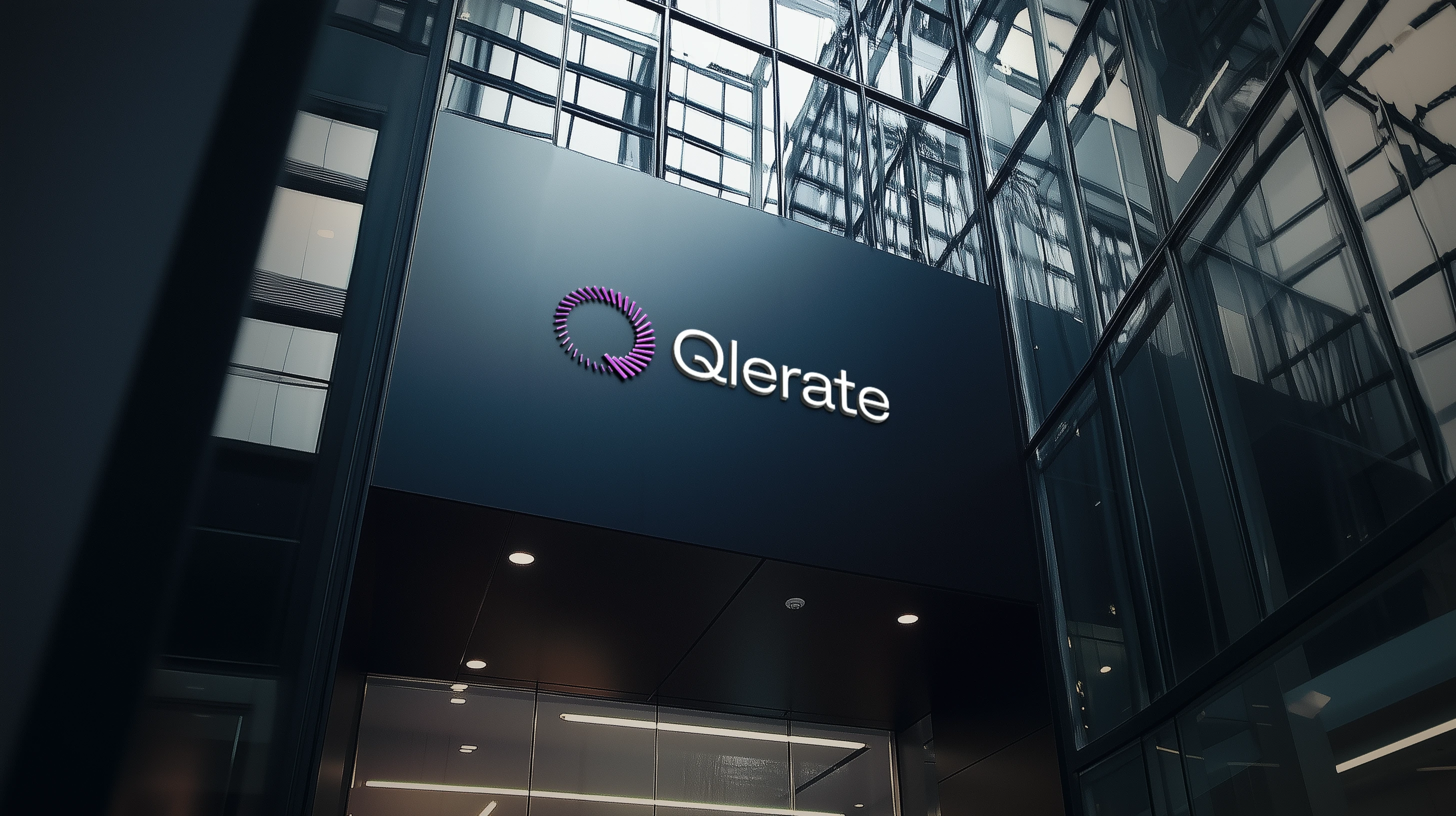
Print & Digital Applications
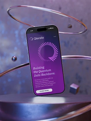
Qlerate’s identity was designed to perform consistently across both digital products and physical touchpoints. The segmented ring remains crisp and recognizable at small sizes—making it ideal for app icons, favicons, UI headers, and social media avatars—while the clean wordmark ensures maximum legibility on screens.
In digital environments, the symbol scales elegantly into motion and gradients, reinforcing the idea of controlled acceleration and “quantum” precision.
In print, the geometry holds its clarity in single-color use and reproduction-heavy formats, from business cards and stationery to large-scale signage. The mark also translates beautifully into premium finishes (embossing, debossing, foil, spot UV), where the segmented structure creates a tactile sense of engineered infrastructure. Overall, the system is built to stay sharp, technical, and enterprise-ready—wherever the brand appears.