Πελάτης
Pine Real Estate Group
Χρονιά
2025
Κλάδος
Real Estate Investment & Development
Υπηρεσίες
Brand naming , Branding , Logo Design , Social media marketing , Web Design
About the Client
Pine is a real estate investment and development company in Greece, dedicated to helping international investors access and manage high-potential assets across the country’s most dynamic markets.
Challenge
The main goal for this client was to create a cohesive and fully integrated brand identity and website that reflects the company’s international, investment-oriented, yet distinctly Mediterranean character.
Branding
Brand Naming
The name Pine Real Estate Group was inspired by the pine tree, a timeless symbol of resilience, longevity, and Mediterranean heritage. Found across both Greece and Israel, the pine represents strength, stability, and natural growth, qualities that mirror the company’s vision of building enduring value through disciplined real estate investment. The name embodies a sense of rootedness and trust, while remaining simple, international, and evocative. Just as the pine tree thrives in diverse landscapes, Pine Real Estate Group connects investors from around the world to the enduring opportunities of the Greek property market.
Logo Design
This logo presents a bold, abstract visual that cleverly blends the silhouette of a modern high-rise building with the subtle geometry of a pine tree. Composed of stacked, symmetrical chevrons pointing upward, the design suggests both architectural height and organic form. The repetition of sharp angles creates a rhythmic, layered effect, evoking structure, growth, and upward momentum, while also hinting at the natural integrity and resilience of pine wood. The minimalist approach keeps the mark clean and versatile, while the strong vertical alignment emphasizes ambition, reliability, and long-term perspective.
Color Palette
The palette unites deep navy, warm beige-gold, charcoal black, and clean off-white to convey refined professionalism with a distinctly Mediterranean soul. Navy anchors the brand with trust and stability (a nod to the Aegean), beige-gold brings sun-warmed stone and understated luxury, charcoal black adds authority and high-contrast sophistication, and off-white delivers clarity and modern openness.
Brand Stationery
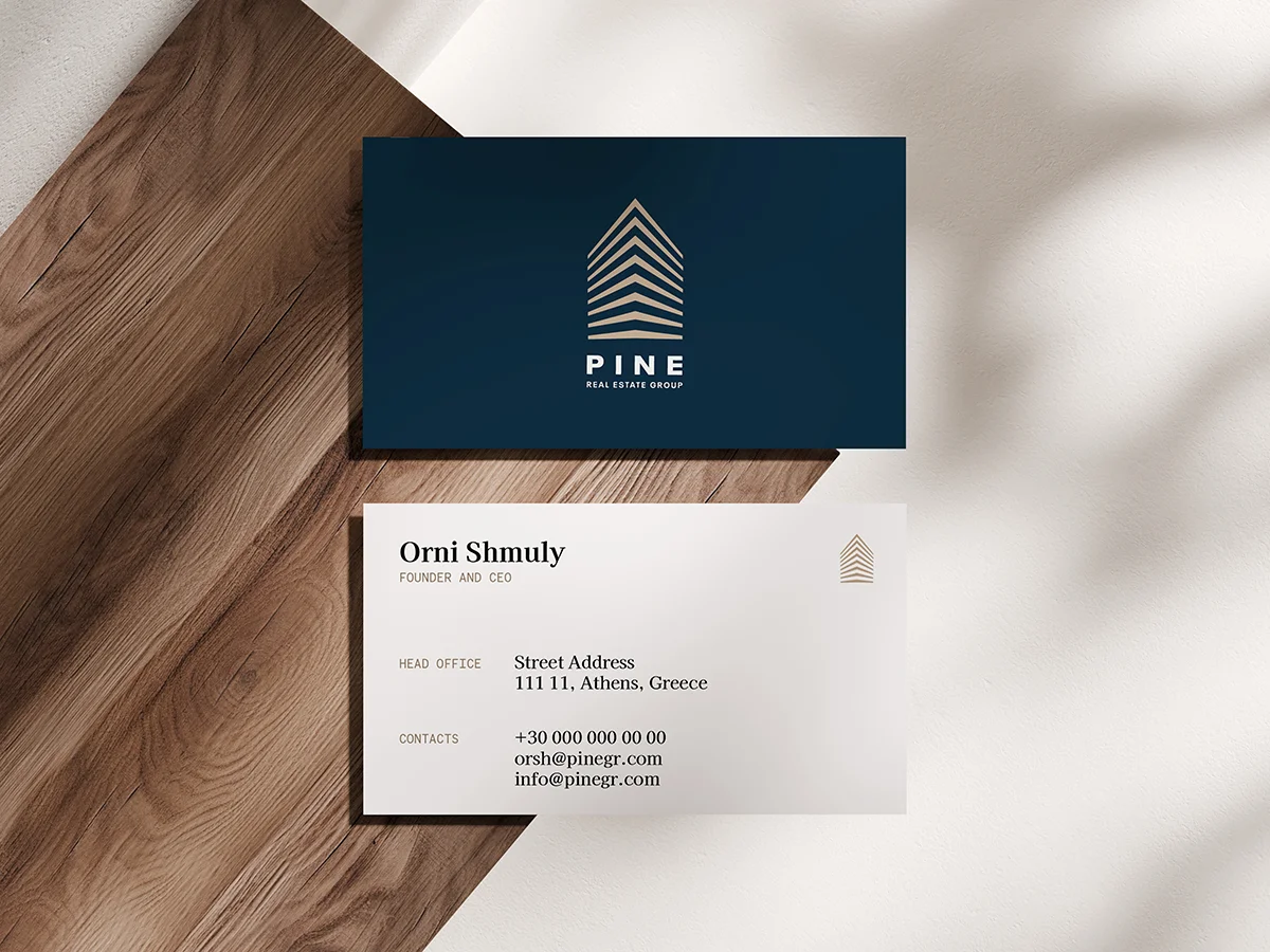
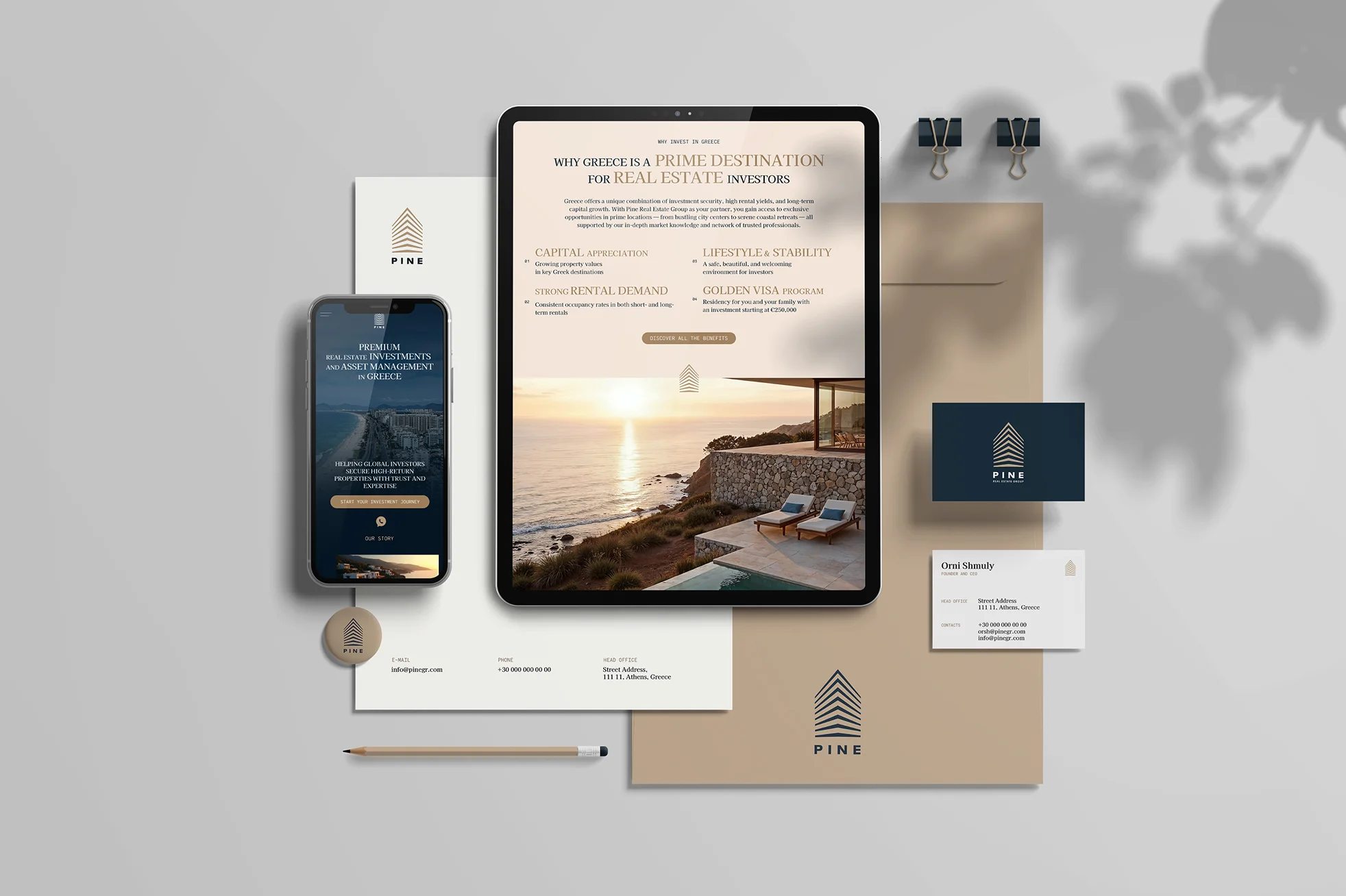
The stationery system was designed to extend the brand’s refined, structured identity into every tangible touchpoint. The business cards and corporate materials balance precision and warmth, combining clean typography with the brand’s deep navy and beige palette to convey professionalism rooted in Mediterranean sophistication.
The front of the card, in dark navy with the beige geometric logo, communicates confidence and solidity, while the reverse side, in crisp white, enhances readability and minimalism.
Web Design & Development
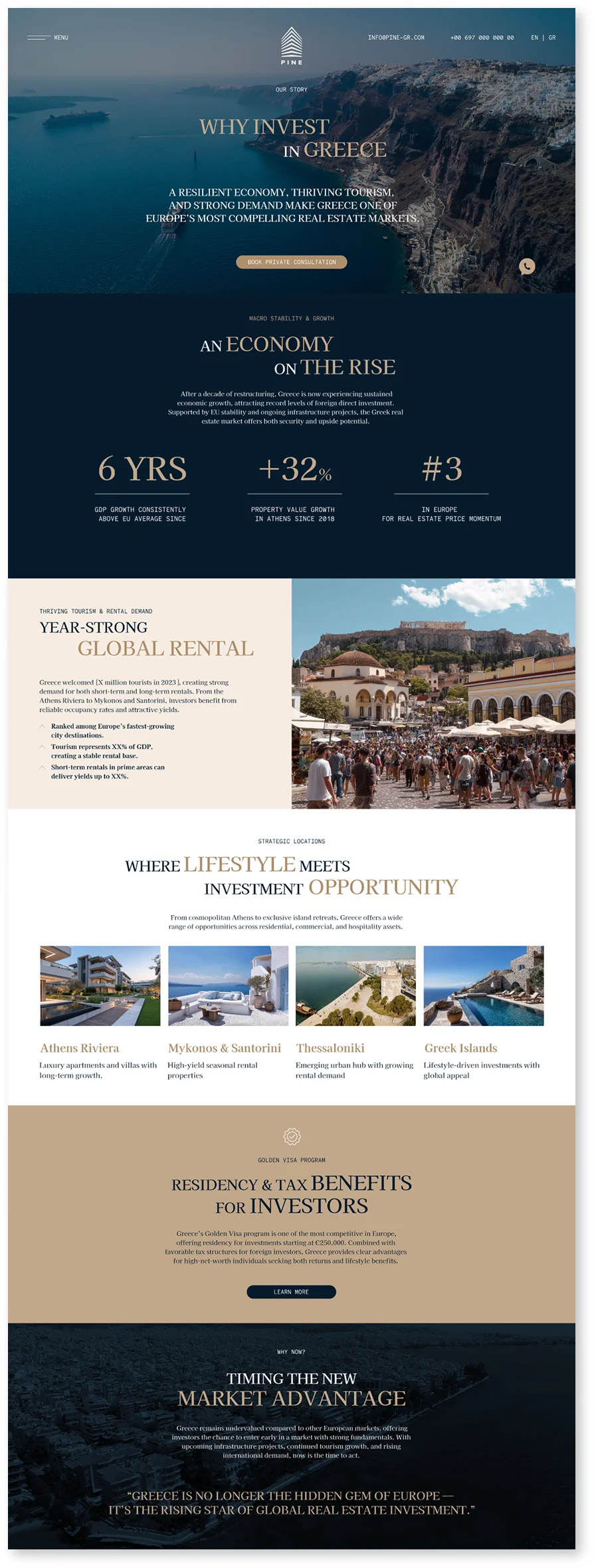
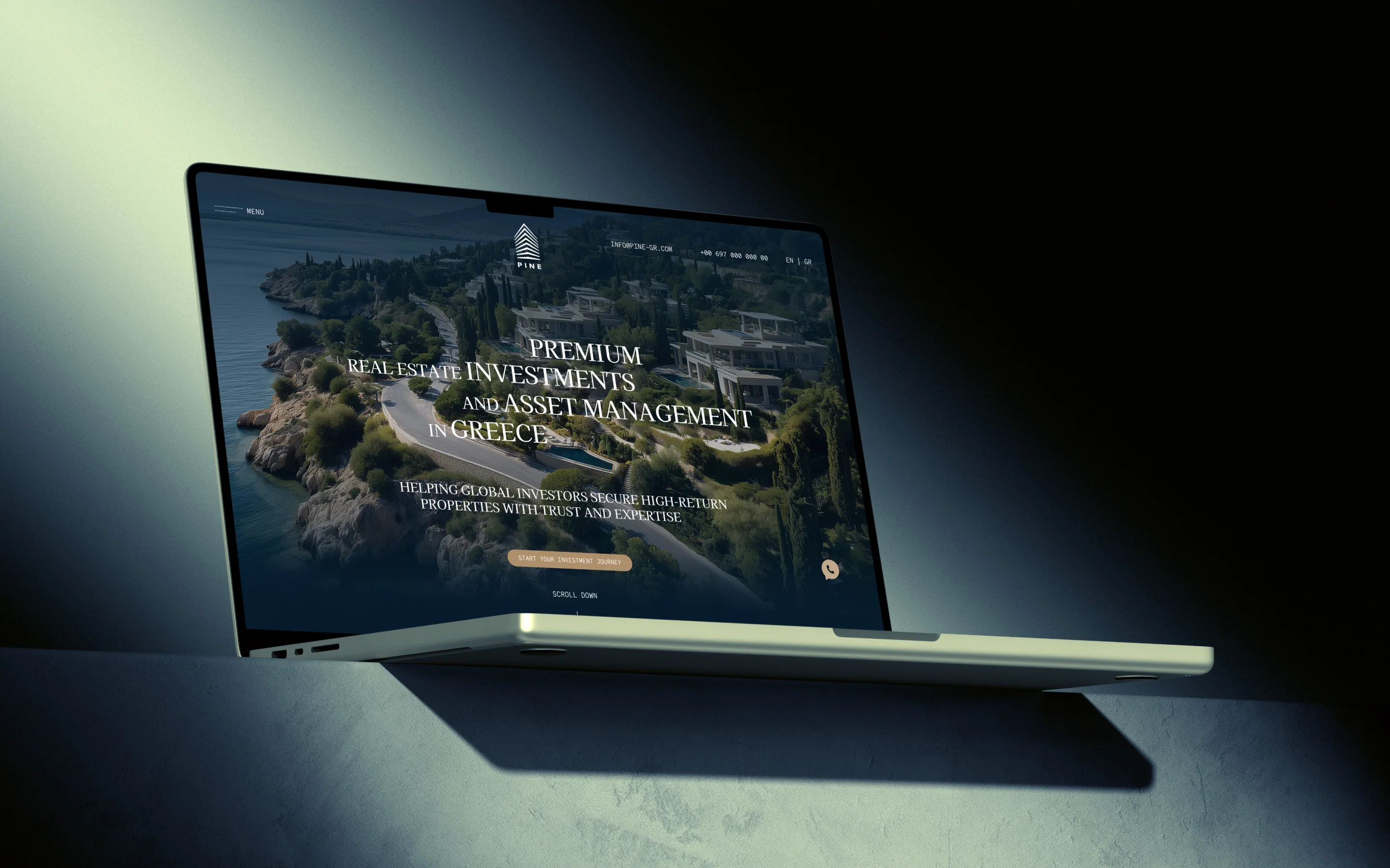
The website was designed as a digital extension of the brand’s core values—trust, structure, and Mediterranean sophistication. Our approach focused on creating a seamless, cinematic experience that balances institutional credibility with emotive visual storytelling. The design language mirrors Pine’s architecture-inspired logo: clean geometry, clear hierarchy, and an upward sense of movement.


