Client
Profi System
Year
2025
Industry
Power quality & protection
About the Client
Profi (Pro-Fi System) is a Greek company based in Athens (Peristeri) that specializes in power quality and the protection of electrical/electronic installations. It operates as a business unit of PROFIT Consultancy & Equipment and combines technical expertise with equipment that it either manufactures itself or commissions to its own specifications. It provides solutions ranging from residential properties to heavy industry and airports, with projects such as active harmonic filter installations, lightning protection, voltage stabilizers and generators in Greece and abroad.
Challenge
Our goal was to reposition Profi as the most reliable partner in power quality, with a modern image and a clear message. At the start of the collaboration we set the following priorities: refreshing the visual identity (brand refresh & logo redesign) for consistency across all touchpoints, upgrading the digital footprint through a new website with a clean content architecture and lead funnels, and targeted campaigns to increase brand awareness, quality leads and measurable results across all key channels.
Visual Identity Refresh
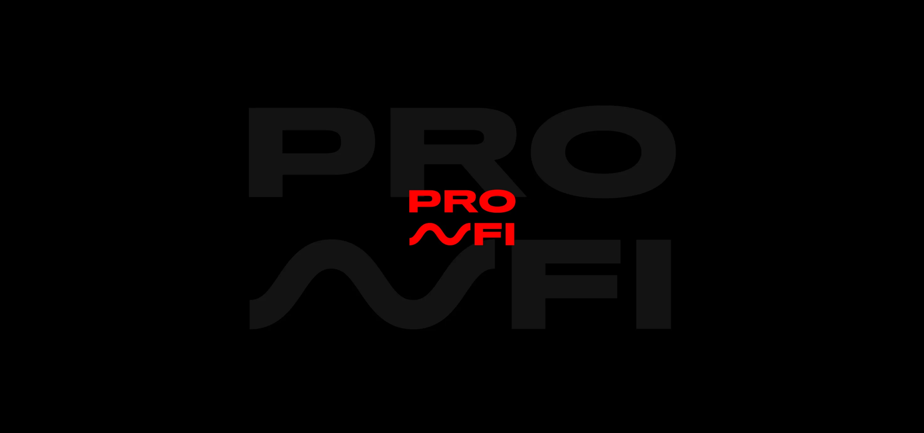
Logo Redesign
The old logo, with its lightning bolt in a black circle and the “Pro.Fi system” wording, was complex and overloaded (dots, tagline, ™) and had an aesthetic that did not scale well. The new mark works better on many levels: it incorporates a half-sinusoidal current wave, uses a robust extended typography, removes the unnecessary elements and strengthens the red/dark contrast for better readability. As a result, the brand moves from an outdated and complicated version to a modern, technical and premium one, with a clearer connection to power quality.
Color Palette
Specifically, both for the refresh of the visual identity and for its subsequent application to the creatives, a color palette was developed with red as the primary color, which had to be retained, complemented by a dark blue. As secondary colors, a light blue and a light gray are used.
Red: energy, decisiveness and urgency—a fit for power quality, protection and immediate action.
Dark blue: reliability, expertise and safety—reflecting engineering, stability and trust.
The combination: high contrast for clarity and hierarchy, with a balance between dynamism (red) and authority (blue).
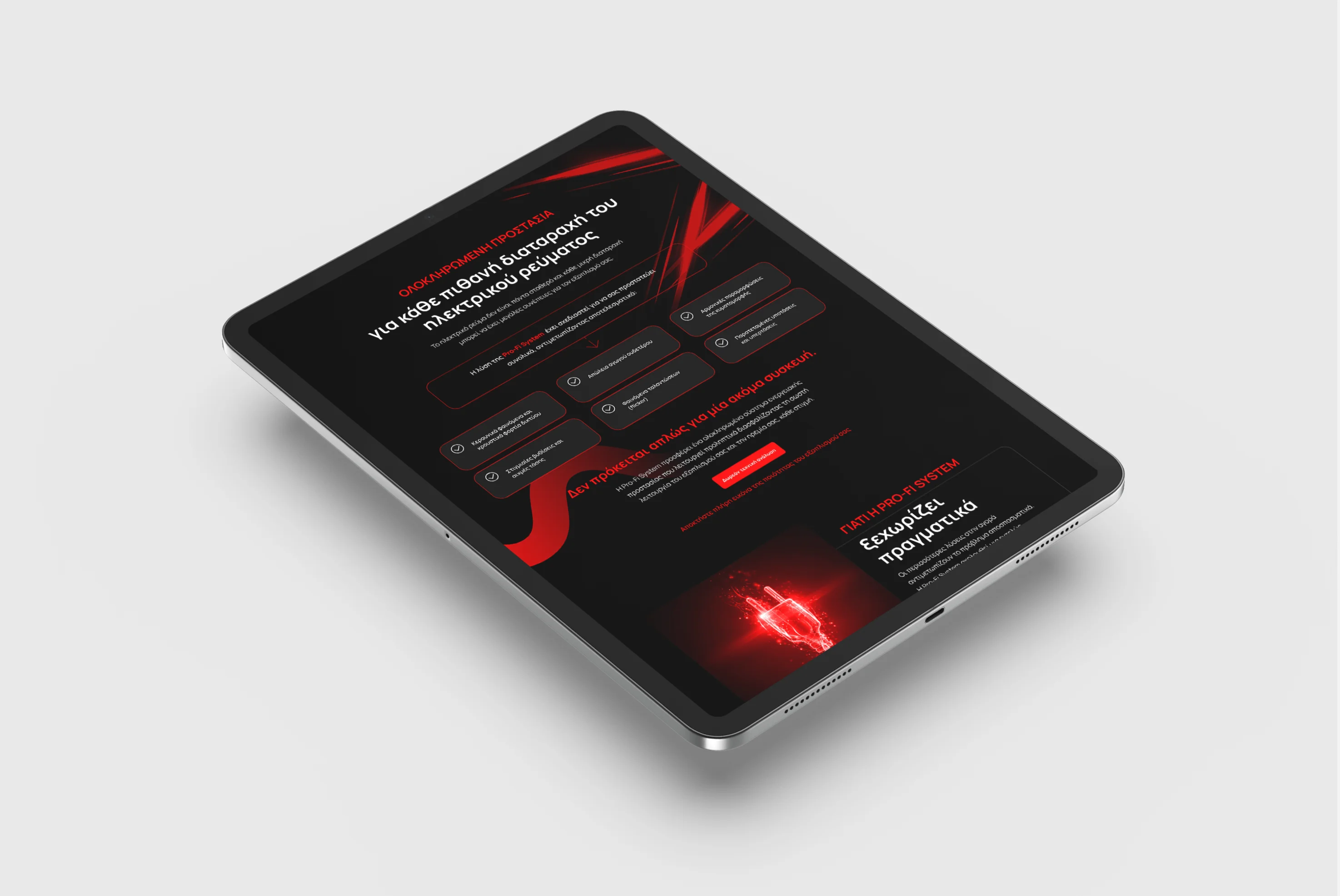
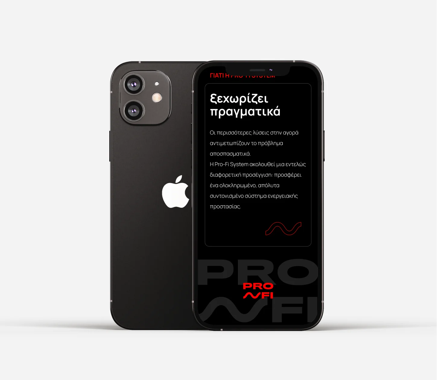
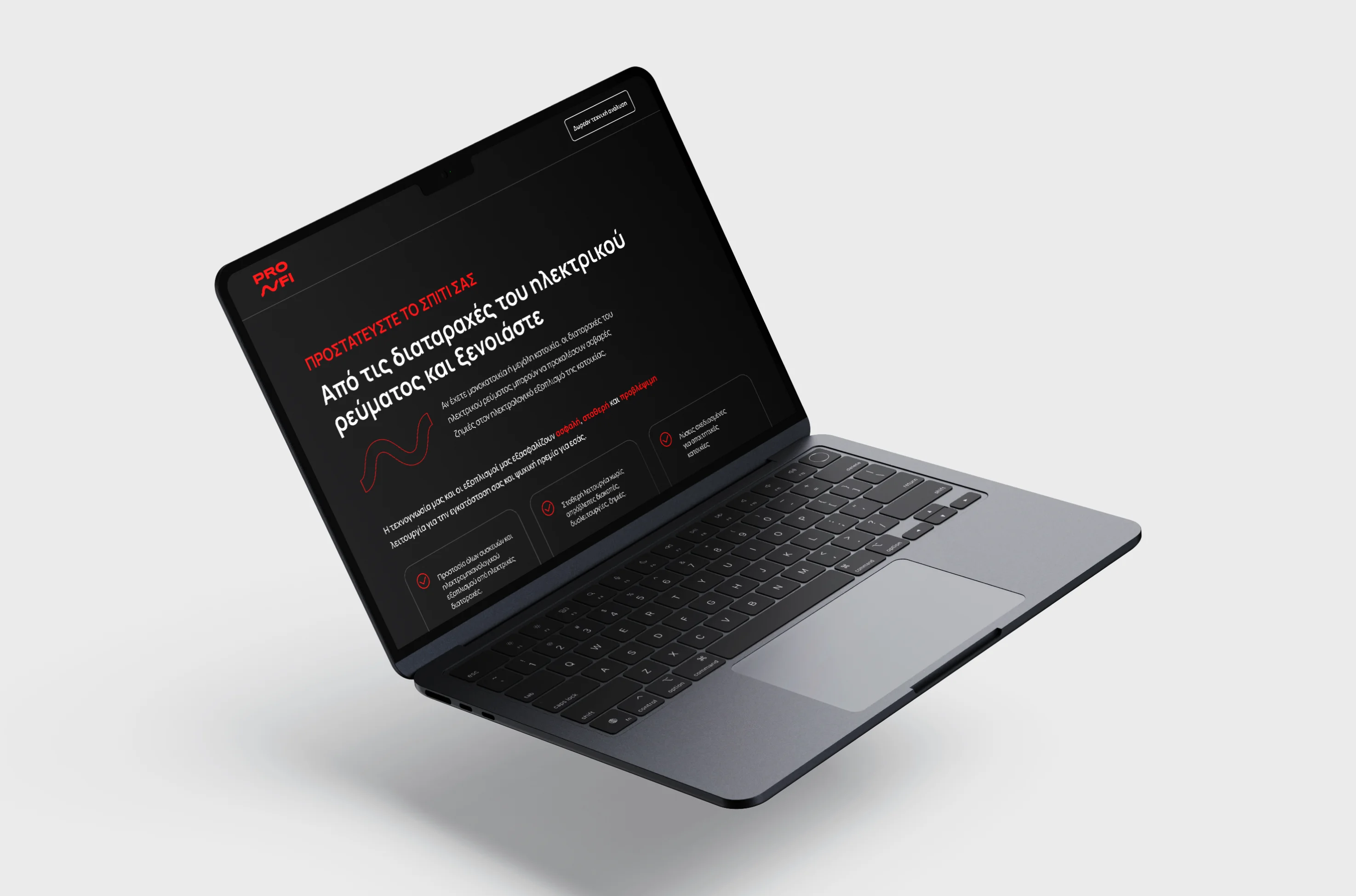
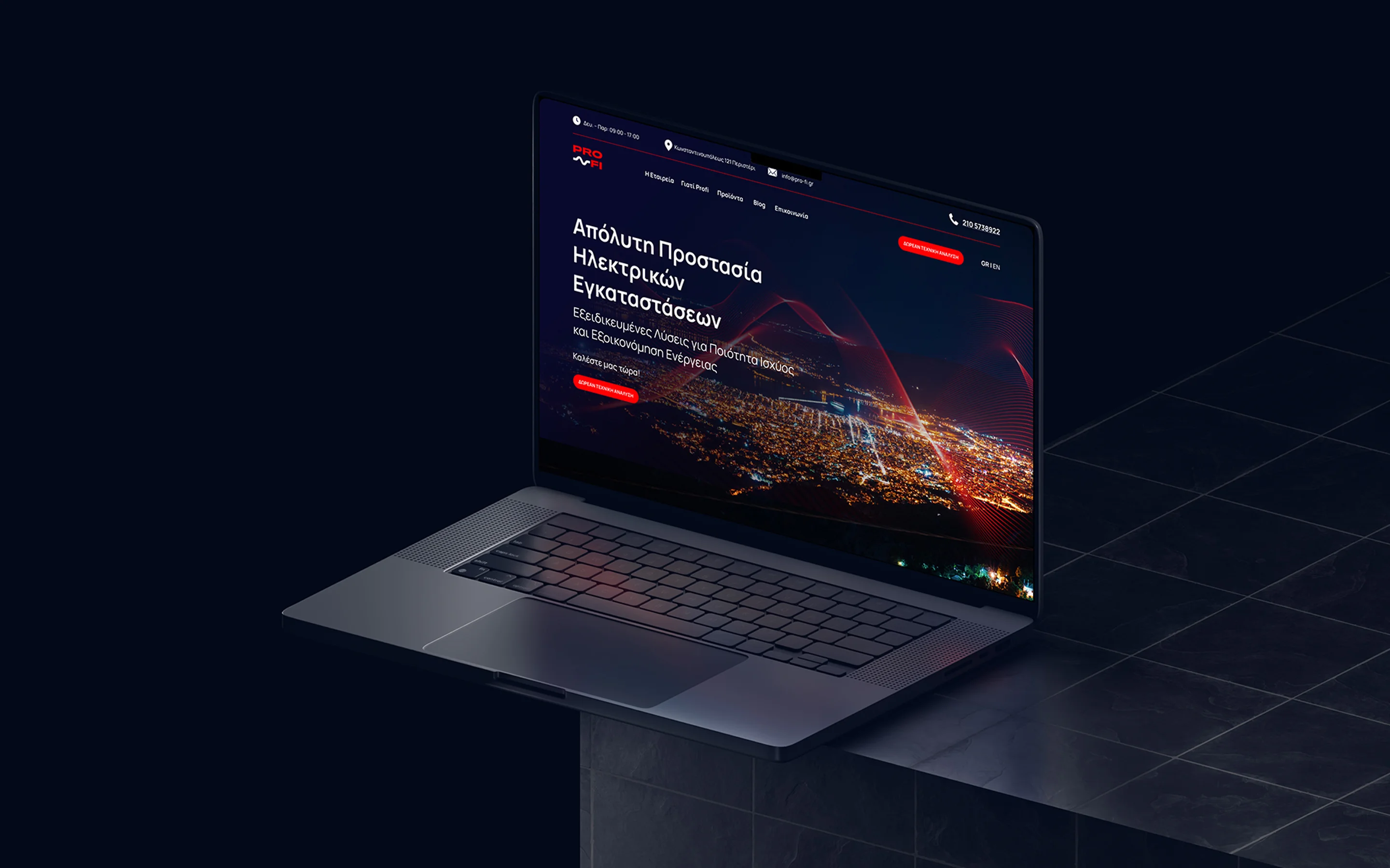
Website Design
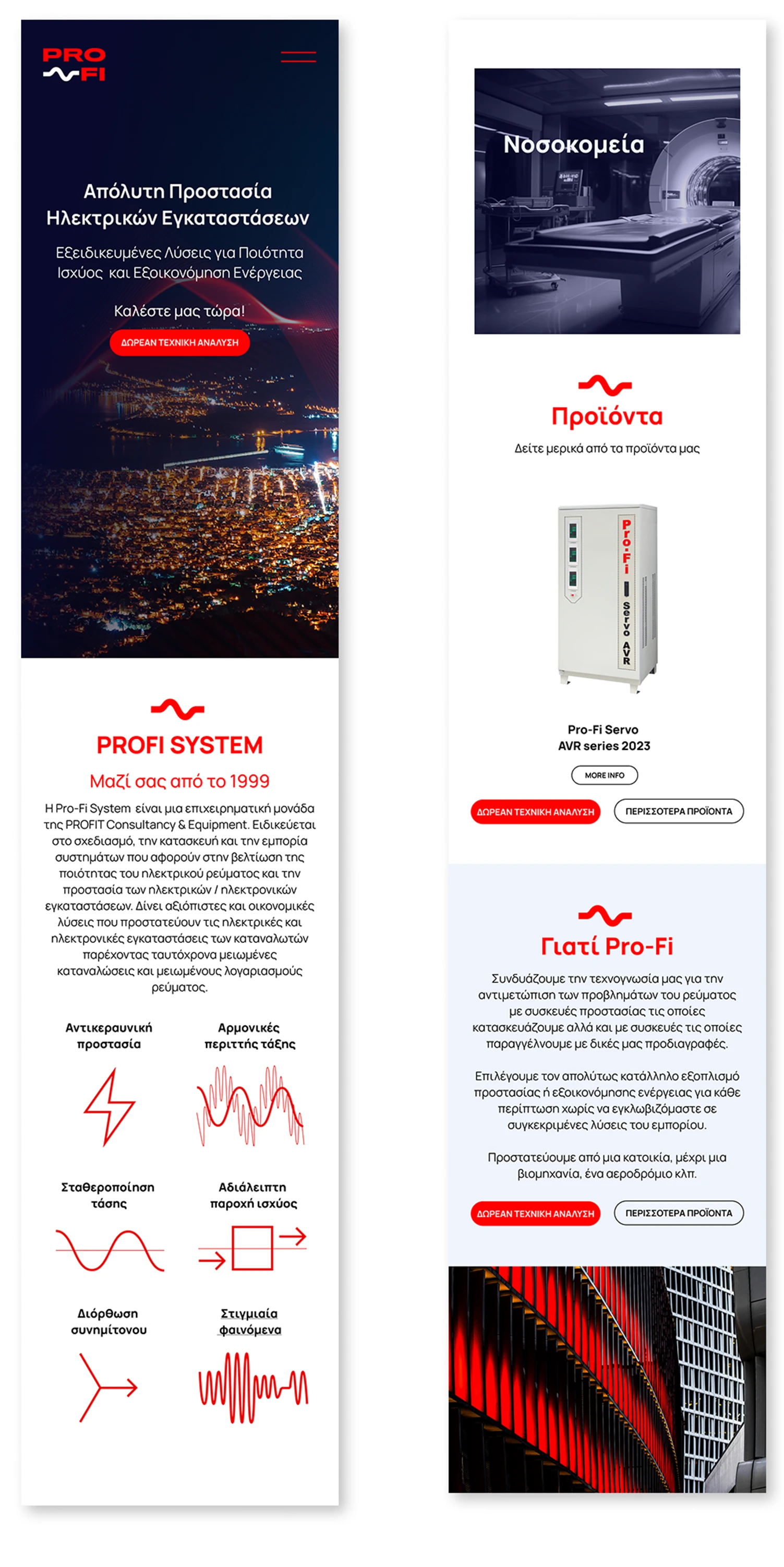
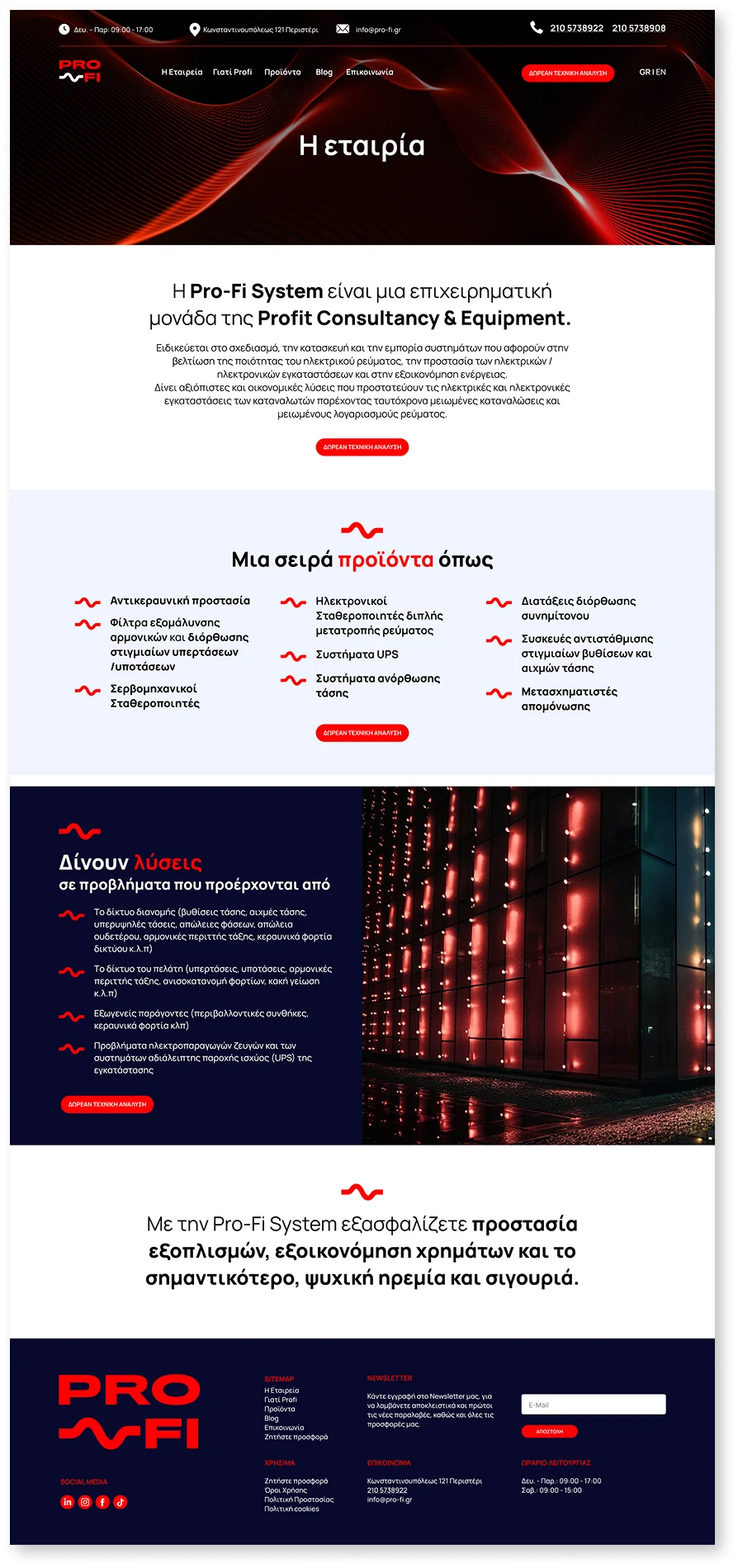
On the new site, the visual identity is applied with consistent use of the color palette for a clear hierarchy, with the new logo/wave mark serving as a strong point of reference in the headers, the call-to-actions, as well as in other graphic elements of the site. The Manrope typeface ensures legibility in large bodies of text, while the extended, bold titles lend technical authority to the product pages. The content architecture organizes solutions and categories (harmonics, voltage stabilization, UPS, etc.) into cards with clear CTAs, technical photography/diagrams and recurring layout patterns, ensuring a unified experience from the home page through to the case studies and the blog.
Performance marketing
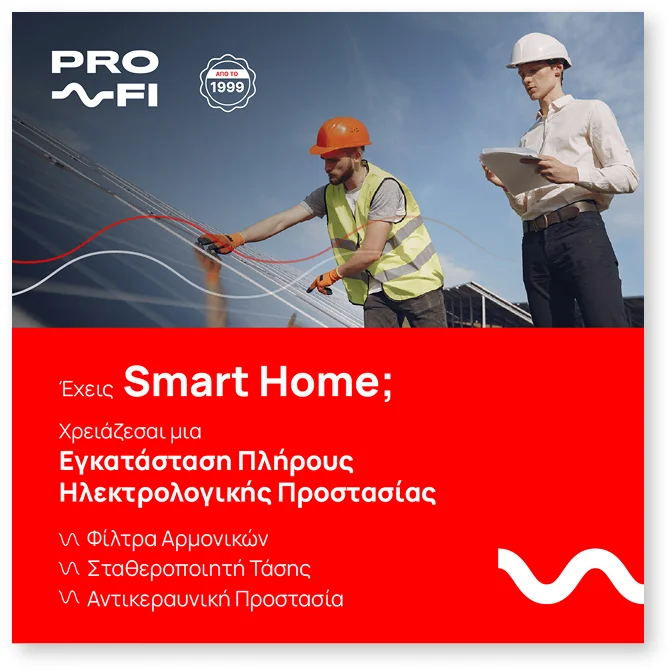
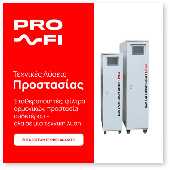
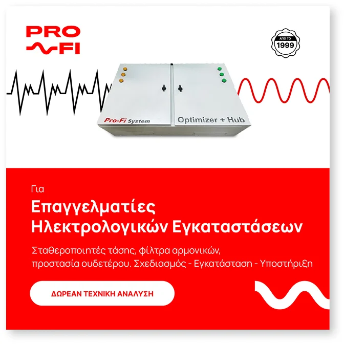
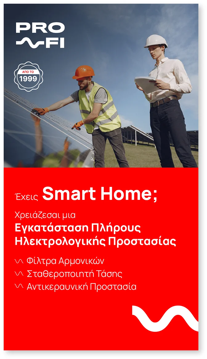
We developed a unified, recognizable identity with a clear hierarchy: the Manrope typeface was used throughout and the CTA «FREE TECHNICAL ANALYSIS» was kept consistent. The red–blue combination was calibrated so that red directs attention to titles/CTAs while blue communicates authority, with the wave motif of the logo maintained everywhere. Product photography was alternated with contextual imagery, clear bullets were placed for the value props, and a «since 1999» mark was added to reinforce credibility.
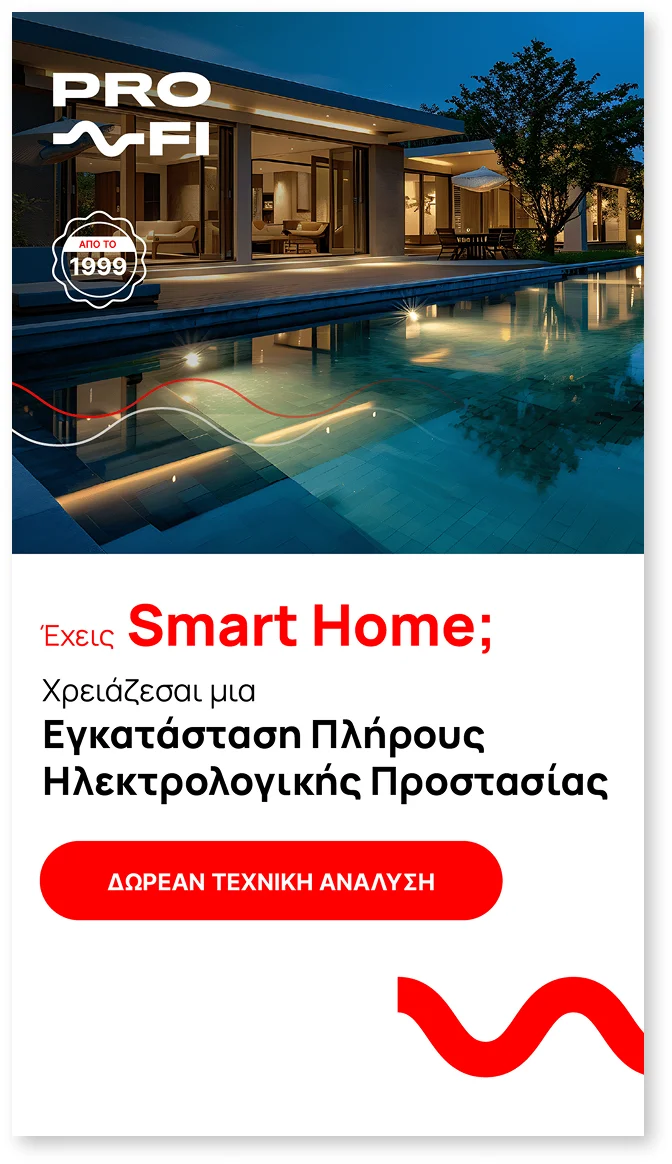
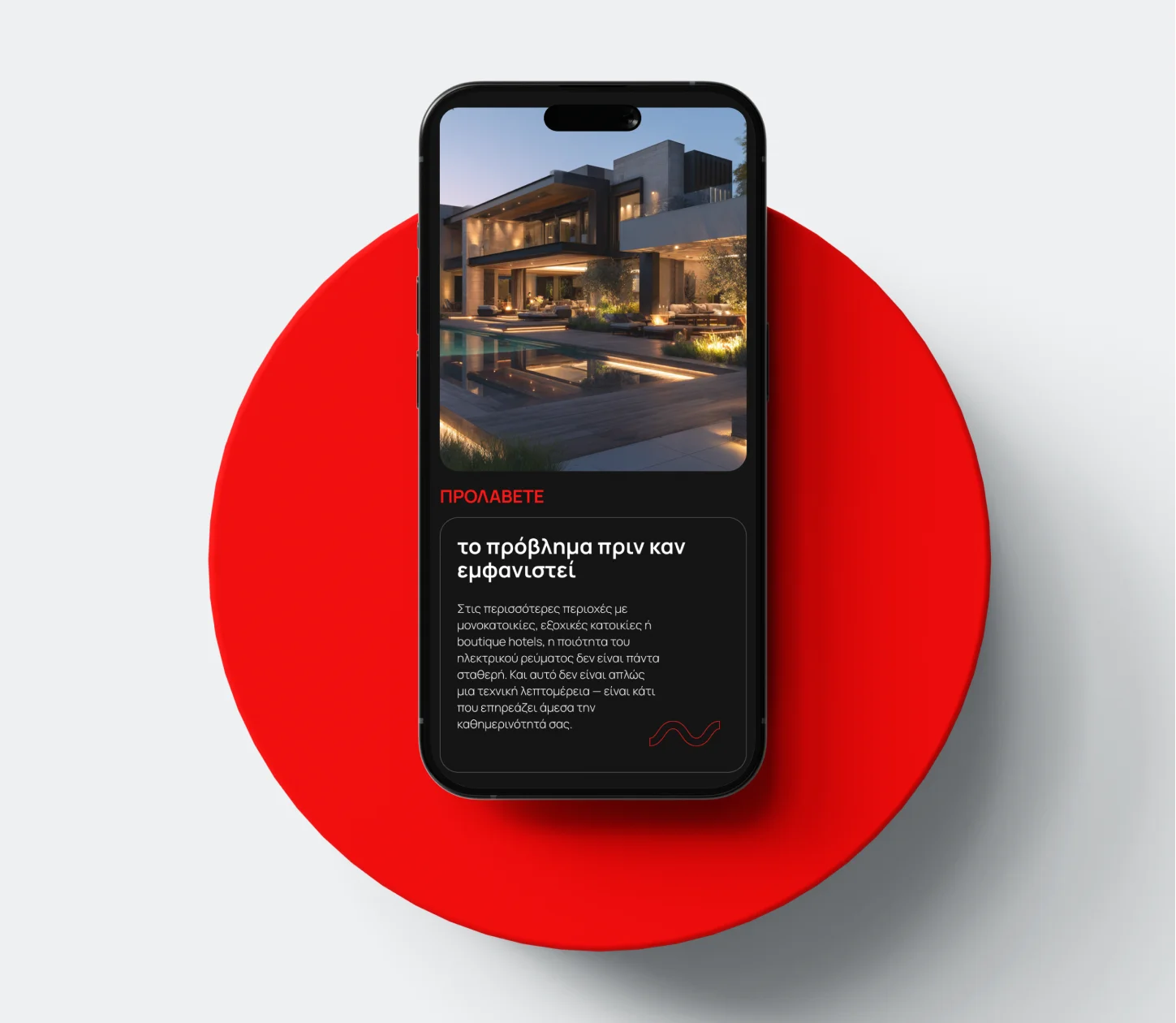
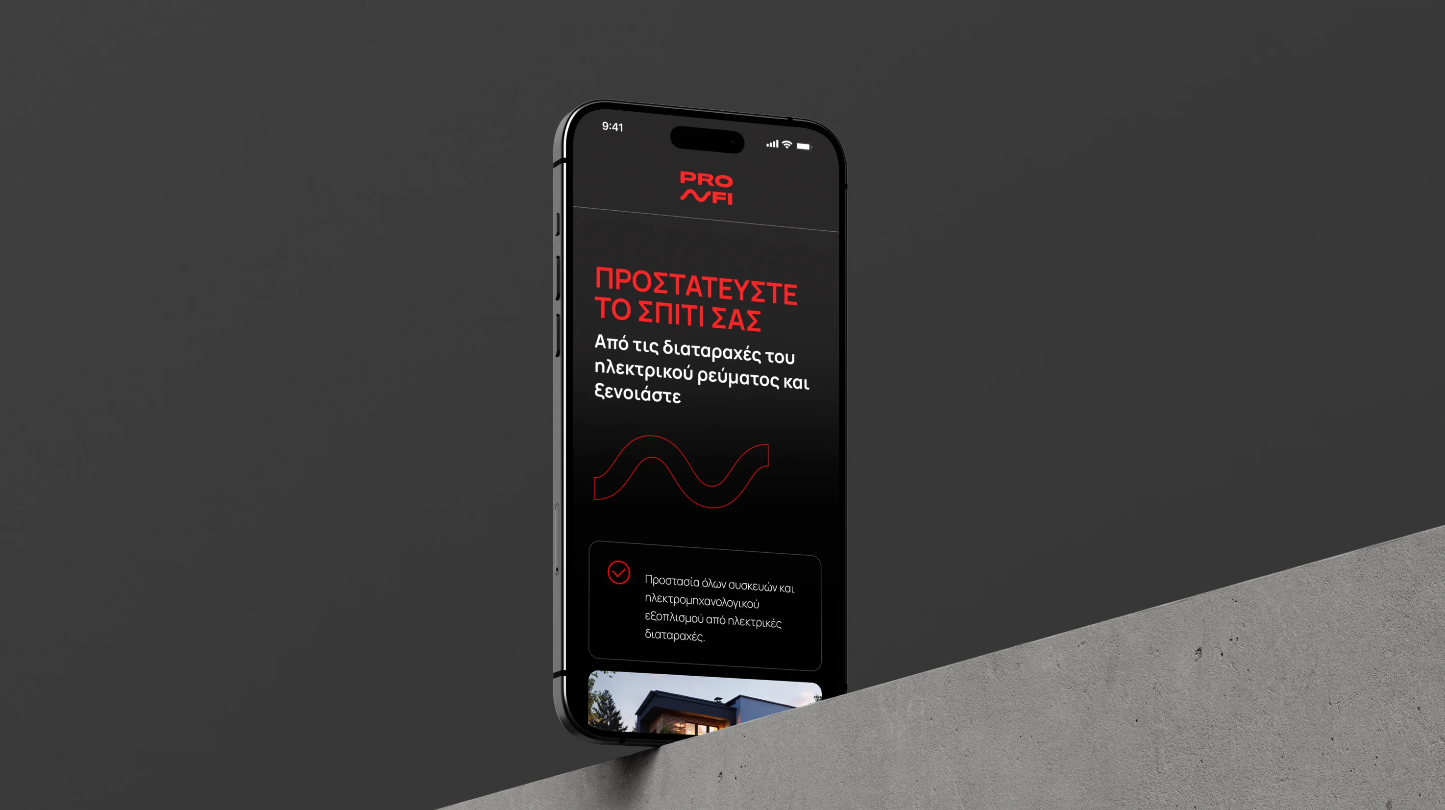
Landing Page Creation
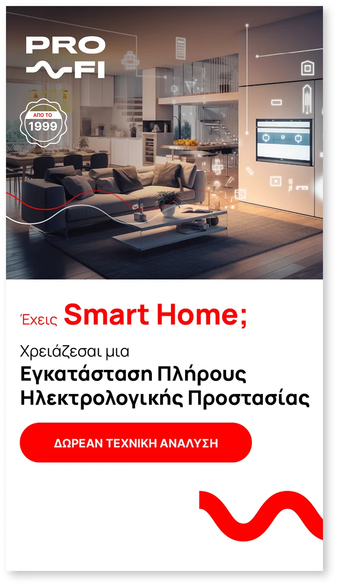
We designed and developed a landing page built around a central philosophy: to meet visitors where they are – in their concern, not in the technical detail. The structure follows a narrative flow that leads naturally from the problem to the solution, with a clear call-to-action at every stage of the scroll.
In terms of design, we chose an aesthetic that combines the feel of a premium residence with technological reliability: dark, strong backgrounds, carefully selected high-end residential lifestyle visuals, and targeted use of color to guide the eye. The page performs equally well on mobile and desktop, with particular attention to loading speed for audiences outside urban centers.
The copywriting was structured around the homeowner’s «pain» – unexpected failures, loss of control, the worry of being away – and turned it into a clear value proposition: prevention instead of reaction.
Results
- A clear conversion path from first contact to the contact form
- Simplification of technical content without loss of credibility
- A design that works for high-end homeowners as well as boutique hospitality
- An increase in quality leads through a targeted landing page structure