Client
Be4light
Year
2025
Industry
Professional Lighting Solutions
Services
Branding , Logo Design , Print
About the Client
Be4light is an international professional lighting solutions company focused on everything that comes before the light, so that the final result is flawless, efficient and aesthetically superior. Combining expertise, innovation and design thinking, it offers comprehensive services that range from lighting studies and installations to training for market professionals. Bold, dynamic and premium in character, Be4light represents a new, global approach to light — where perfection begins before the light.
Challenge
The goal of the project was to create a complete identity that captures the passion, vision and ambition behind Be4light. A brand born from personal dedication and creative determination, intended to express dynamism, confidence and an international outlook. The design direction focused on building a modern, flexible and recognisable identity, capable of supporting the company’s outward-facing growth and serving as the vehicle for its entry into international markets.
Branding
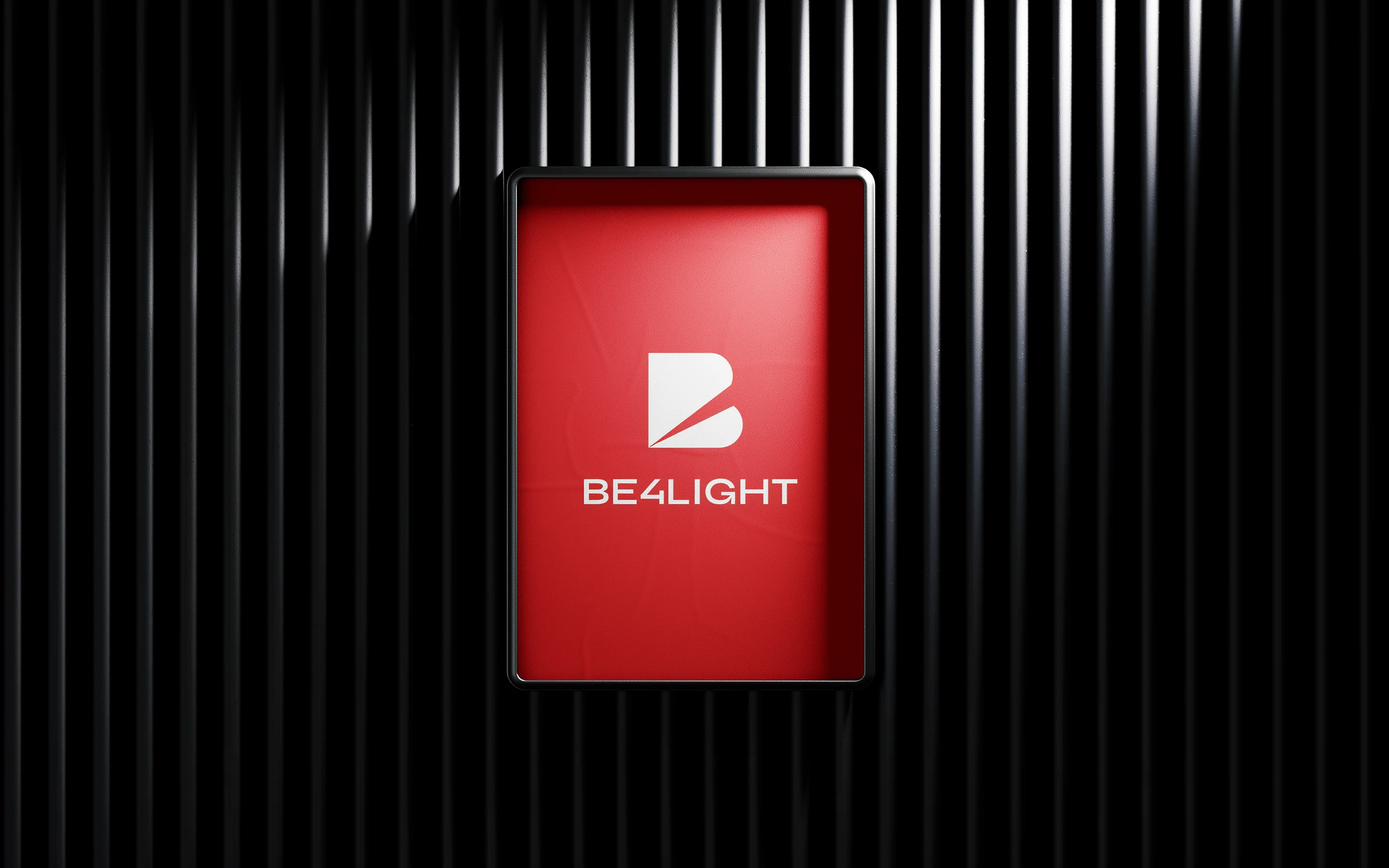
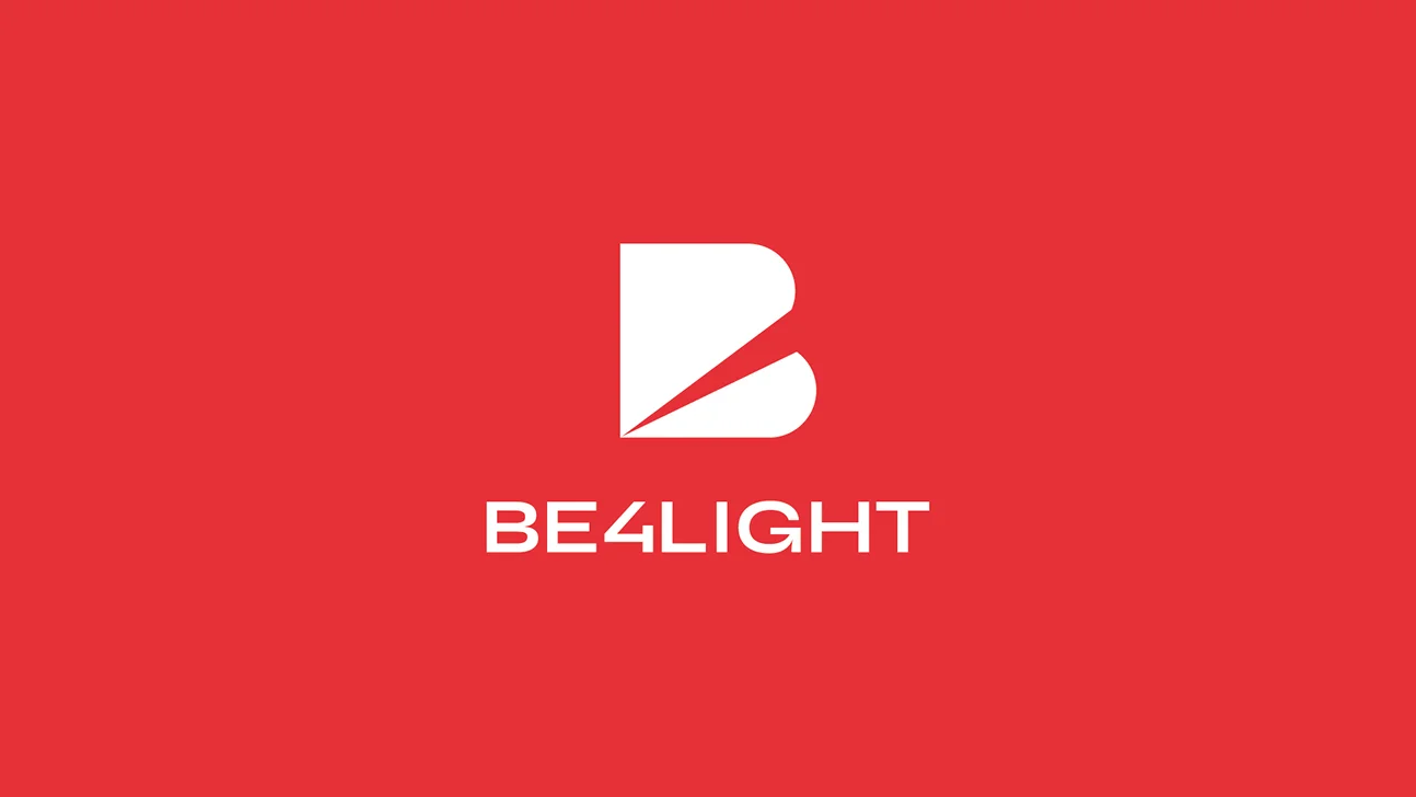
Logo Design
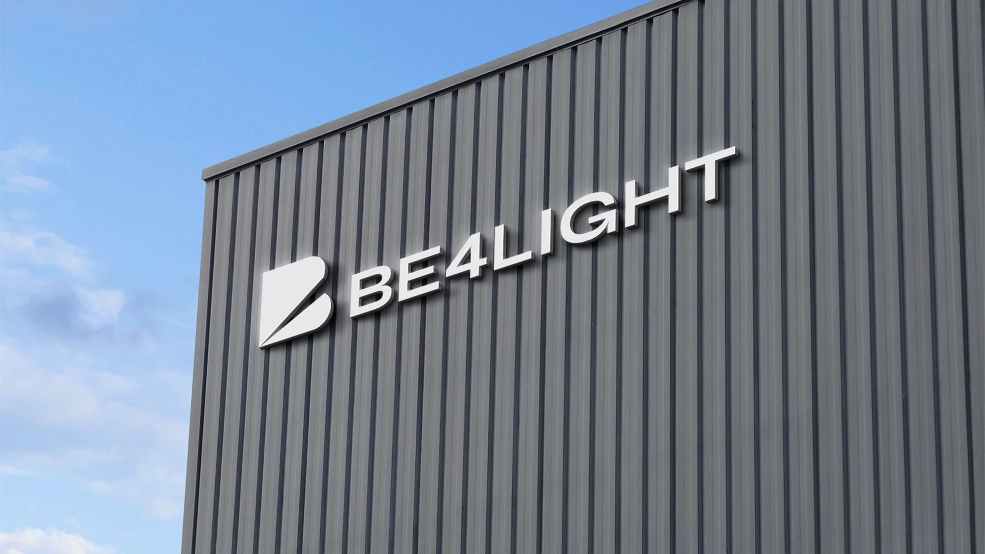
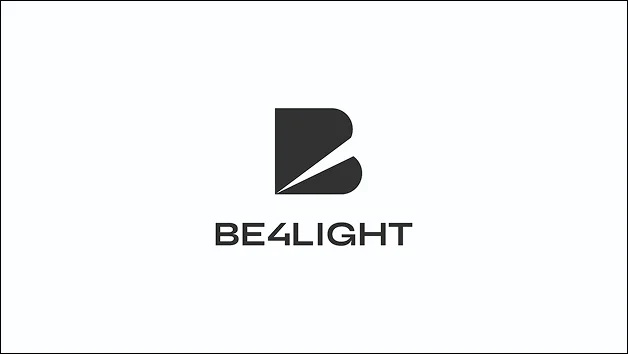
The design of the Be4light logo was built on the concept of “Before Light” — everything that comes before the light to make it possible. The letter B, with its bold and extended form, is cut diagonally by a clean line that symbolises the beam of light, direction and precision. The choice of the extended Syne typeface supports this character: it emphasises stability, lends prestige and strengthens the logo’s presence on large surfaces and across international media. The clean, geometric design and the harmonious balance between mass and empty space create a sense of energy and progress. The result is a logo that is modern, timeless and functional, reflecting Be4light’s expertise and its ambition to stand with confidence in a global market.
Color Palette
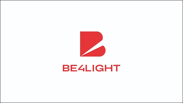
The choice of red for Be4light was no accident; it was a deliberate decision that reflects the dynamism, boldness and intensity that define the brand. Red acts as a carrier of energy and action — it evokes the warmth and power of light, as well as the passion behind the company’s creation. At the same time, it gives the logo a sense of confidence and a premium character, without becoming aggressive. In an industry dominated by cool or neutral tones, Be4light’s red sets itself apart and asserts its presence: a brand that is not afraid to stand out and to light up the market in its own way.
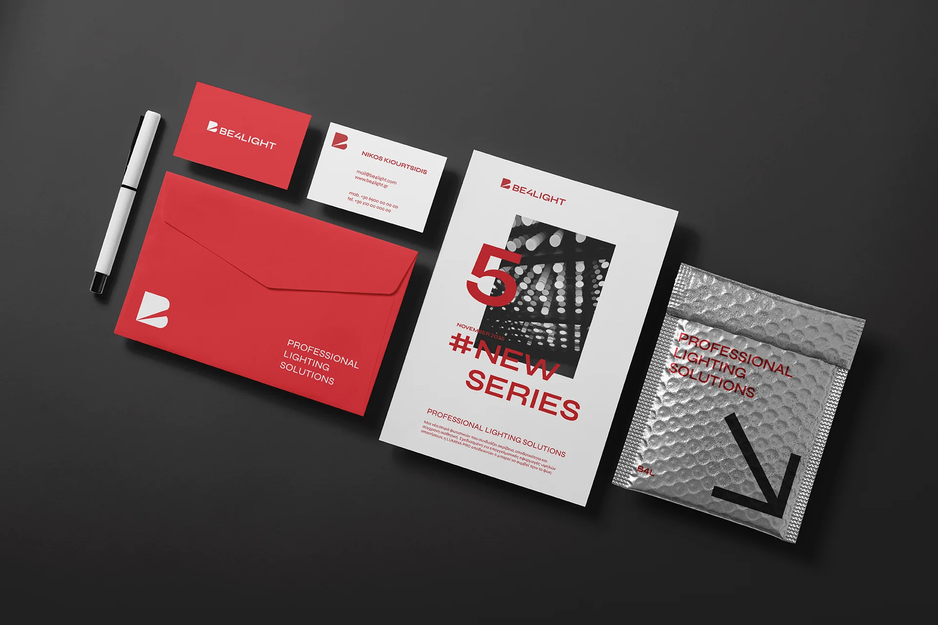
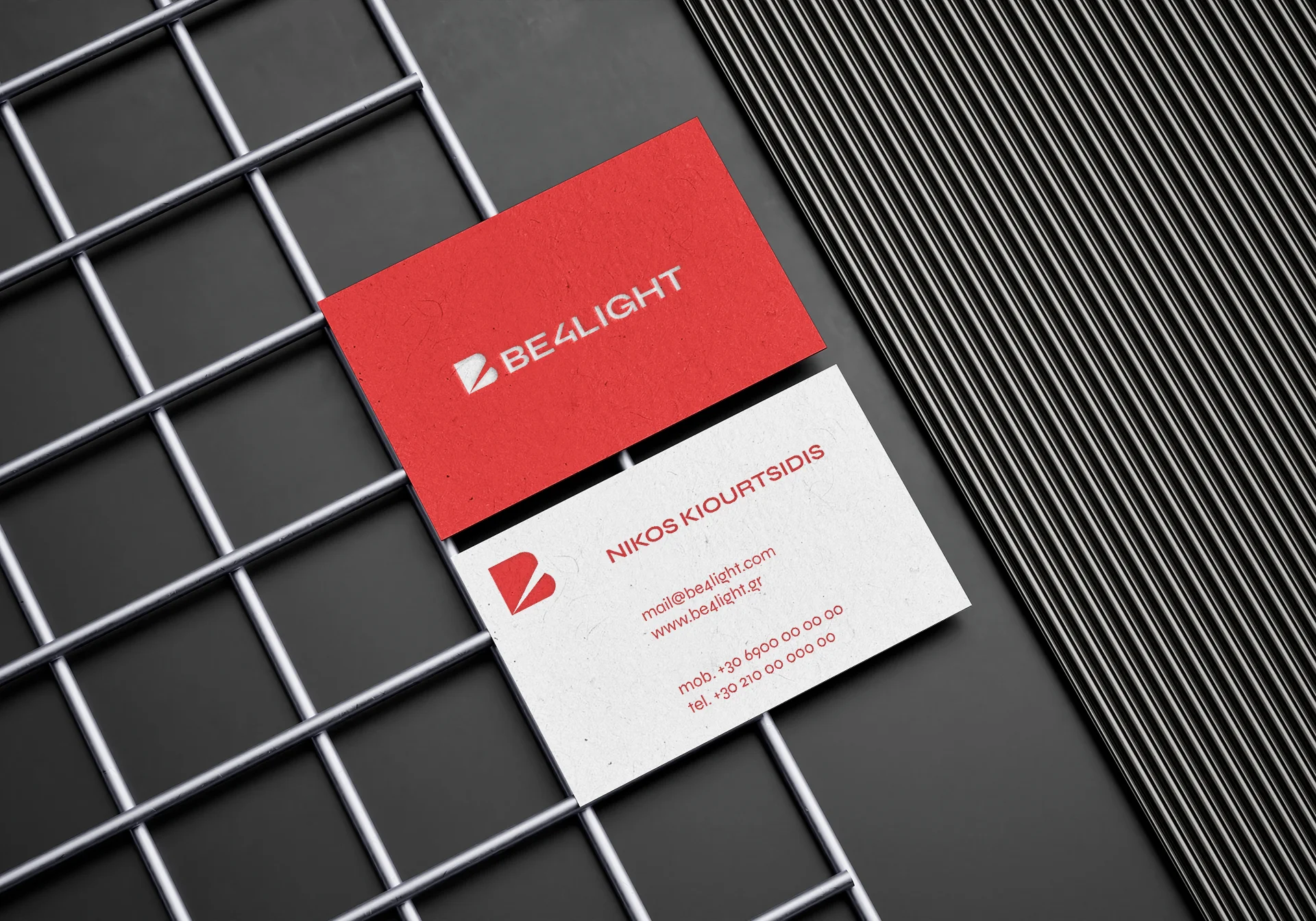
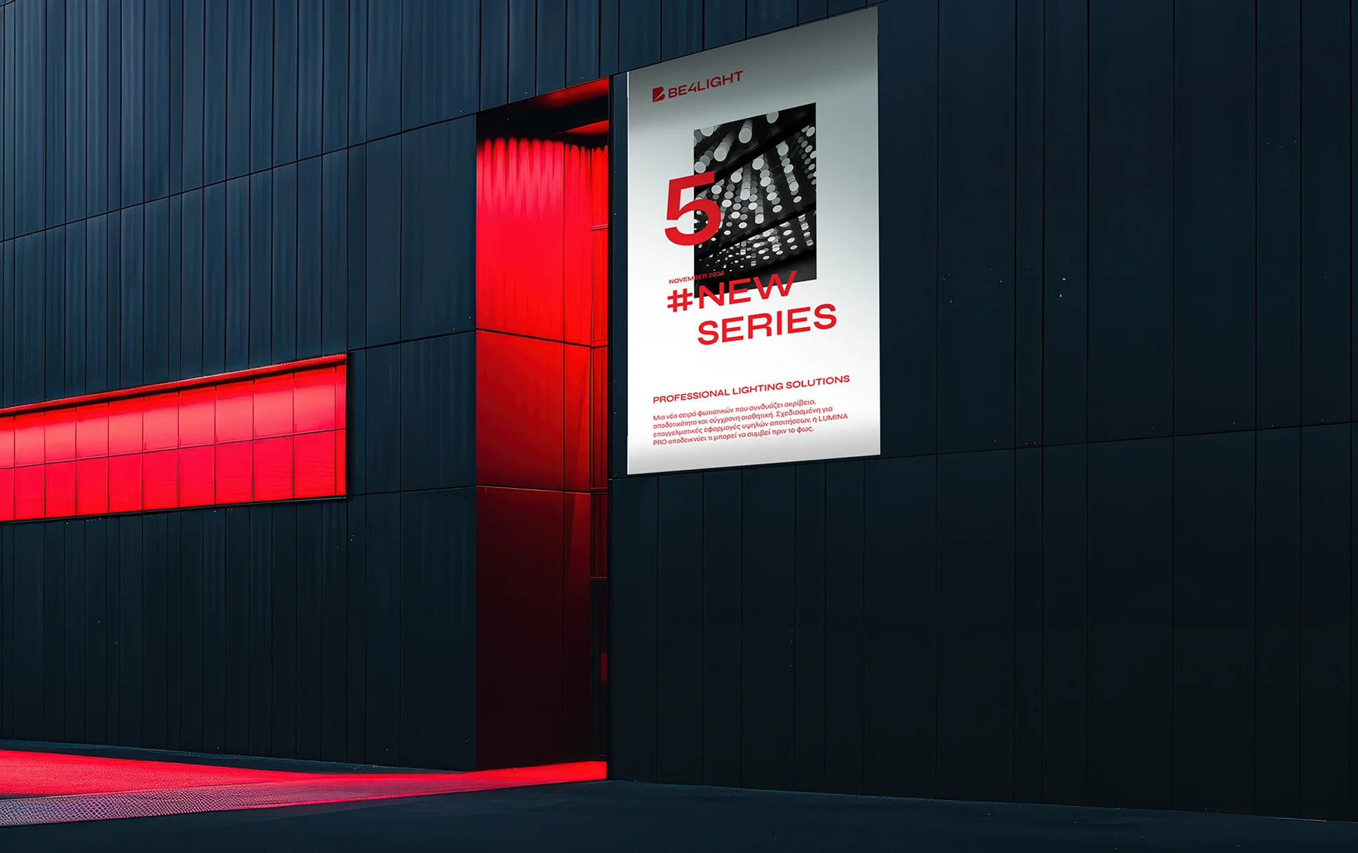
Brand Stationery
The design of Be4light’s corporate materials follows the same philosophy as the logo: clarity, geometry and intensity. Red dominates as the core identity element, creating dynamic contrasts with white and black backgrounds, while the clean lines and rigorous typography of Syne lend structure and consistency. Every element — from the business card to the envelope and the printed material — has been designed with an emphasis on functionality and visual balance, showcasing the company’s premium profile. The overall composition exudes modern professionalism, consistently supporting the brand across every application.