Πελάτης
VM Properties
Χρονιά
2025
Κλάδος
Real Estate Investment & Development
Υπηρεσίες
Google Ads , Logo redesign , Marketing Strategy , Performance marketing , Rebranding , Social media creatives
Σχετικά με τον Πελάτη
Η VM Properties είναι ένα ταχύτατα αναπτυσσόμενο μεσιτικό γραφείο με ισχυρή παρουσία σε όλη την Αθήνα, με δραστηριότητα στο Παγκράτι, τη Νέα Σμύρνη, το Χαλάνδρι και το Περιστέρι.
Με πολλαπλά γραφεία και ένα δίκτυο που διευρύνεται σταθερά, η εταιρεία επικεντρώνεται στη διευκόλυνση των συναλλαγών ακινήτων με αποτελεσματικότητα και αξιοπιστία, χτίζοντας μακροχρόνιες σχέσεις με ιδιοκτήτες ακινήτων και επενδυτές.
Η Πρόκληση
Παρά την ταχεία ανάπτυξή της, η VM Properties αντιμετώπιζε μια βασική πρόκληση:
- Αύξηση του όγκου των ιδιοκτητών ακινήτων (πωλητών) που εισέρχονται στο pipeline της
- Ενίσχυση της αναγνωρισιμότητας της μάρκας σε μια ιδιαίτερα ανταγωνιστική αγορά real estate
- Δημιουργία ψηφιακής παρουσίας που αντικατοπτρίζει το μέγεθος και τον επαγγελματισμό της
- Υποστήριξη της δευτερεύουσας ζήτησης από αγοραστές χωρίς να αποδυναμώνεται ο κύριος στόχος
Ο βασικός στόχος ήταν σαφής: Να καταστεί η VM Properties η πρώτη μάρκα που έρχεται στο μυαλό των ιδιοκτητών που θέλουν να πουλήσουν.
Rebranding
Επανασχεδιάσαμε τη μάρκα ώστε να αντανακλά σαφήνεια, αυτοπεποίθηση και προσβασιμότητα.
Η νέα ταυτότητα ισορροπεί:
- Μια τολμηρή, μοντέρνα οπτική γλώσσα (σκούρους τόνους & έντονη αντίθεση)
- Ένα διακριτό accent color που τραβά την προσοχή και ενισχύει τη μνήμη
- Καθαρή τυπογραφία που ενισχύει την αναγνωσιμότητα σε όλες τις πλατφόρμες
Logo Design
Το νέο λογότυπο της VM Properties βασίζεται στο οπτικό θεμέλιο της προηγούμενης ταυτότητας, όπου το στοιχείο του σπιτιού έπαιζε κεντρικό ρόλο. Αντί να το αφαιρέσουμε, επιλέξαμε να το επανερμηνεύσουμε, κάνοντάς το πιο αφηρημένο, πιο εκλεπτυσμένο και πιο διαχρονικό. Εκεί που το προηγούμενο λογότυπο απεικόνιζε ένα σπίτι κυριολεκτικά, το νέο σήμα το αποδίδει σε μια μινιμαλιστική γεωμετρική φόρμα που παραπέμπει στη δομή και στο σπίτι, χωρίς να δεσμεύεται σε μία μόνο σημασία. Αυτό που το καθιστά πραγματικά ξεχωριστό είναι η σκέψη πίσω από αυτό: το σπίτι δεν είναι απλώς ένα σύμβολο που προστέθηκε στη μάρκα – είναι χτισμένο από τα ίδια τα γράμματα της μάρκας. Το V και το M σχηματίζουν φυσικά τη γραμμή της στέγης και το περίγραμμα ενός σπιτιού, μετατρέποντας τα αρχικά και το εικονίδιο σε ένα ενιαίο σήμα. Το αποτέλεσμα είναι μια ταυτότητα που ξεπερνά το real estate ως κατηγορία και μιλά αντ’ αυτού για κάτι πιο διαρκές: την ιδέα του σπιτιού.


Color Palette
Η νέα παλέτα χρωμάτων βασίζεται σε ένα τολμηρό πορτοκαλί, που χρησιμοποιείται ως το κύριο χρώμα της μάρκας για να μεταδώσει ενέργεια, ορατότητα και αυτοπεποίθηση σε μια ανταγωνιστική αγορά real estate. Ισορροπείται από έναν βαθύ navy τόνο που ενισχύει την εμπιστοσύνη και τον επαγγελματισμό, ενώ απαλές ουδέτερες αποχρώσεις προσθέτουν σαφήνεια και ζεστασιά σε όλες τις εφαρμογές. Το αποτέλεσμα είναι ένα διακριτό και ευπροσάρμοστο σύστημα που ενισχύει την αναγνωρισιμότητα της μάρκας, διατηρώντας παράλληλα μια ισχυρή αίσθηση αξιοπιστίας.
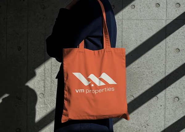
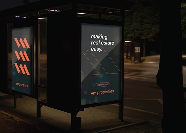
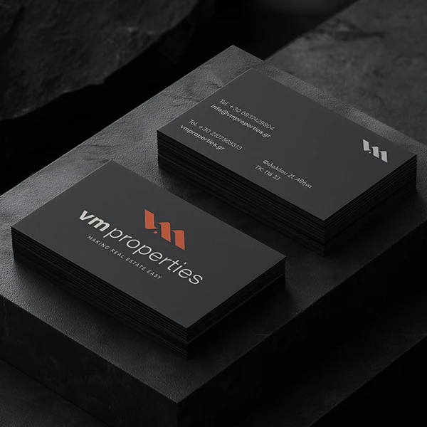
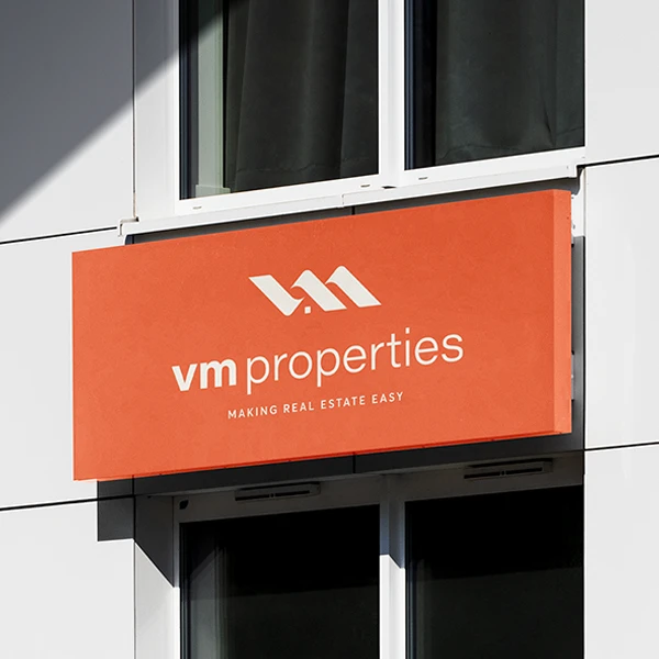
Brand Stationery
Η ταυτότητα της μάρκας επεκτάθηκε σε μια σειρά έντυπων εφαρμογών, σχεδιασμένων ώστε να εξασφαλίζουν ισχυρή ορατότητα και συνέπεια σε πραγματικά περιβάλλοντα. Από επαγγελματικές κάρτες και επιγραφές μέχρι υπαίθριες αφίσες και επώνυμα υλικά, η τολμηρή χρήση του κύριου πορτοκαλί δημιουργεί άμεση εντύπωση, ενώ οι σκούροι βασικοί τόνοι ενισχύουν την αίσθηση επαγγελματισμού και εμπιστοσύνης.
Το σύστημα του λογοτύπου και τα γραφικά στοιχεία εφαρμόζονται με ευελιξία, επιτρέποντας στη μάρκα να ξεχωρίζει τόσο σε μινιμαλιστικά όσο και σε φορμά υψηλής ορατότητας. Το αποτέλεσμα είναι μια συνεκτική οπτική παρουσία που ενισχύει την αναγνωρισιμότητα της εταιρείας.

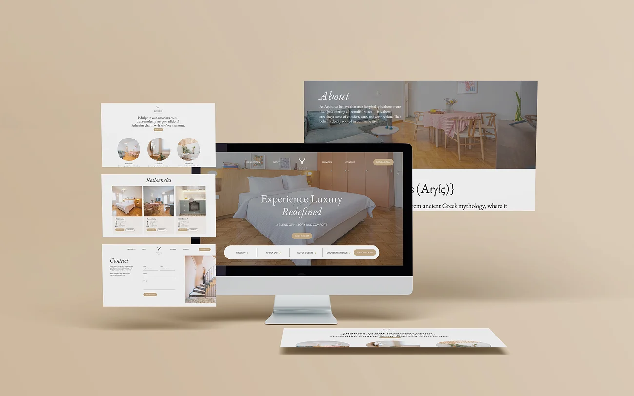
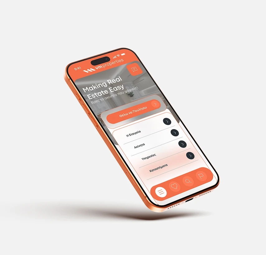
Web Design
Η ιστοσελίδα σχεδιάστηκε με σαφή έμφαση στη χρηστικότητα, την ταχύτητα και τη μετατροπή των χρηστών. Μια καθαρή και δομημένη διάταξη επιτρέπει στους χρήστες να πλοηγούνται χωρίς κόπο, ενώ η στρατηγική χρήση της παλέτας χρωμάτων της μάρκας ενισχύει την οπτική ιεραρχία και κατευθύνει την προσοχή στις βασικές ενέργειες.
Ο σχεδιασμός ισορροπεί τον επαγγελματισμό με την προσιτότητα, διασφαλίζοντας ότι τόσο οι ιδιοκτήτες ακινήτων όσο και οι αγοραστές μπορούν να βρουν γρήγορα τις πληροφορίες που χρειάζονται. Συνολικά, η ιστοσελίδα λειτουργεί ως μια μοντέρνα, υψηλών επιδόσεων πλατφόρμα που υποστηρίζει την ανάπτυξη και την ψηφιακή παρουσία της μάρκας.


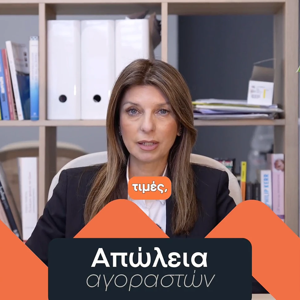
Performance marketing
Οι καμπάνιες performance marketing αξιοποιούν δυναμικά βίντεο creatives για να προσελκύσουν το κοινό και να οδηγήσουν σε conversions. Κάθε βίντεο είναι σχεδιασμένο ώστε να στοχεύει συγκεκριμένες προθέσεις των χρηστών, με σαφή calls to action που ενθαρρύνουν τους ιδιοκτήτες ακινήτων να κάνουν το επόμενο βήμα. Τα βίντεο συνδυάζουν ισχυρά οπτικά στοιχεία, όπως προβολή ακινήτων και χρώματα της μάρκας, με περιεκτικά μηνύματα εστιασμένα σε άμεσες ανησυχίες όπως η εκτίμηση και η πώληση ακινήτου. Ενσωματώνοντας εξατομίκευση και οπτικά στοιχεία υψηλής εντύπωσης, αυτές οι διαφημίσεις είναι βελτιστοποιημένες ώστε να τραβούν γρήγορα την προσοχή και να καθοδηγούν τους θεατές απρόσκοπτα μέσα από τη διαδικασία λήψης απόφασης, αυξάνοντας τελικά τη δημιουργία leads και την αναγνωρισιμότητα της μάρκας.

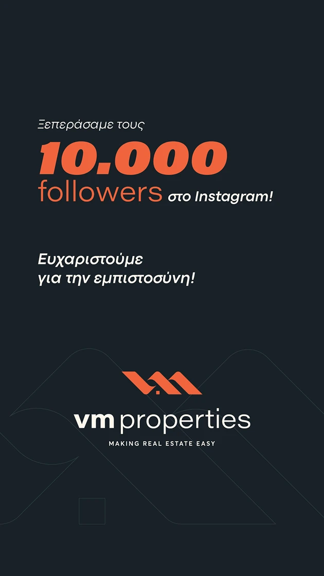
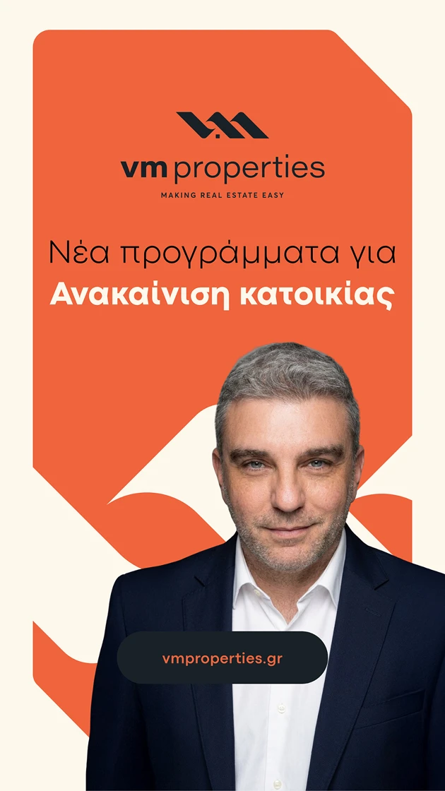
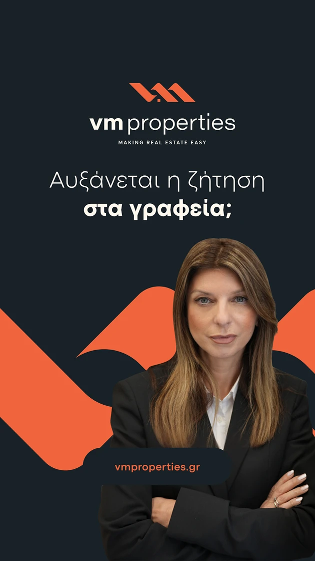
Social media creatives
Τα social media creatives σχεδιάστηκαν γύρω από ένα σαφές και συνεπές σύστημα διάταξης, χρησιμοποιώντας τολμηρό color blocking (πορτοκαλί και σκούρο navy) για τη δημιουργία ισχυρής οπτικής ιεραρχίας και άμεσης αναγνωρισιμότητας. Τα βασικά μηνύματα και οι λεπτομέρειες των ακινήτων τοποθετούνται σε περιοχές υψηλής αντίθεσης για γρήγορη αναγνωσιμότητα, ενώ γεωμετρικά σχήματα εμπνευσμένα από το λογότυπο ενισχύουν την ταυτότητα της μάρκας. Ο συνδυασμός δομημένων διατάξεων με πορτρέτα και εικόνες ακινήτων εξασφαλίζει ευελιξία σε διαφορετικούς τύπους περιεχομένου, διατηρώντας παράλληλα μια συνεκτική και επαγγελματική εμφάνιση.
Αποτελέσματα
- Σημαντική αύξηση της ορατότητας της μάρκας σε όλα τα ψηφιακά κανάλια
- Σημαντική ανάπτυξη στη δημιουργία leads από πωλητές
- Βελτιωμένη συνέπεια σε όλες τις πλατφόρμες (ιστοσελίδα, διαφημίσεις, social)
- Σαφής τοποθέτηση ως ένα μοντέρνο, αξιόπιστο μεσιτικό γραφείο στην Αθήνα