Client
Cretan Gea
Year
2025
Industry
Experiential tourism
Services
About the Client
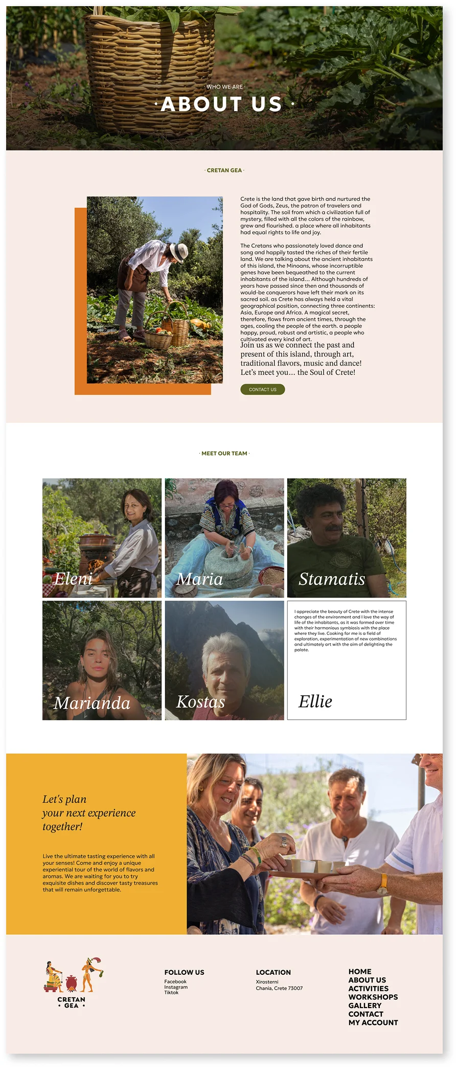
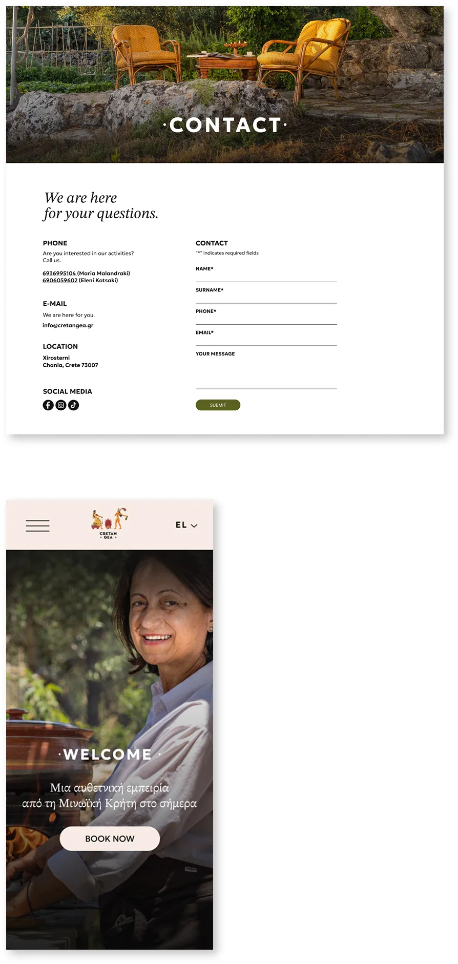
Cretan Gea is a Greek company based in Xirosterni, Chania, Crete, specializing in “experiential tourism” and in showcasing Cretan tradition through gastronomy, the arts and local products, offering authentic flavors and knowledge to both individual travelers and groups.
Challenge
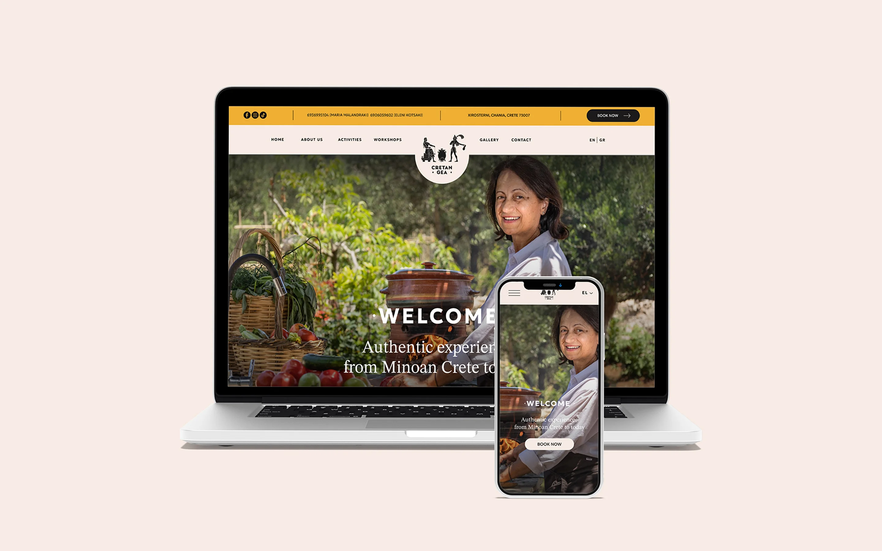
Our goal was to give Cretan Gea a clean, modern and cohesive image. For the visual identity, the aim was a premium yet warm style that captures the authentic Cretan experience—with a new logo, a balanced color palette and typography.
Visual Identity Refresh
Logo Redesign
In refreshing the logo, we kept the distinctive Minoan illustration intact, as the client requested, and worked discreetly around it to improve clarity and applicability. We aligned the composition (figures–cauldron–figure) and cleaned up the outlines so it “reads” better at small sizes, without altering the style. The biggest change was in the typography: we replaced the handwritten wordmark with a solid, geometric uppercase lettering, adding subtle bullets. The result is a more legible, premium wordmark that ties in with the illustration and works reliably across all applications (digital, print, signage, micro-uses).
Color Palette
For the new color palette we drew inspiration from the Minoan land and everyday life in Crete: warm terracotta and ochre (soil, wheat), olive greens (olive trees, herbs) and deeper earthy tones for weight and elegance, with balancing neutrals (cream/off-white and dark charcoal) for clean typography. We adapted tones/shades for light and dark backgrounds, ensured contrasts that meet WCAG for readability, and provided simple combination rules so the palette ties in naturally with photography and performs consistently across web, social, print and signage.